Reasons for a Redesign
- Hard to find necessary information, too many pages, content overload.
- Inconsistent and complicated shopping process with too many unnecessary steps to purchase products.
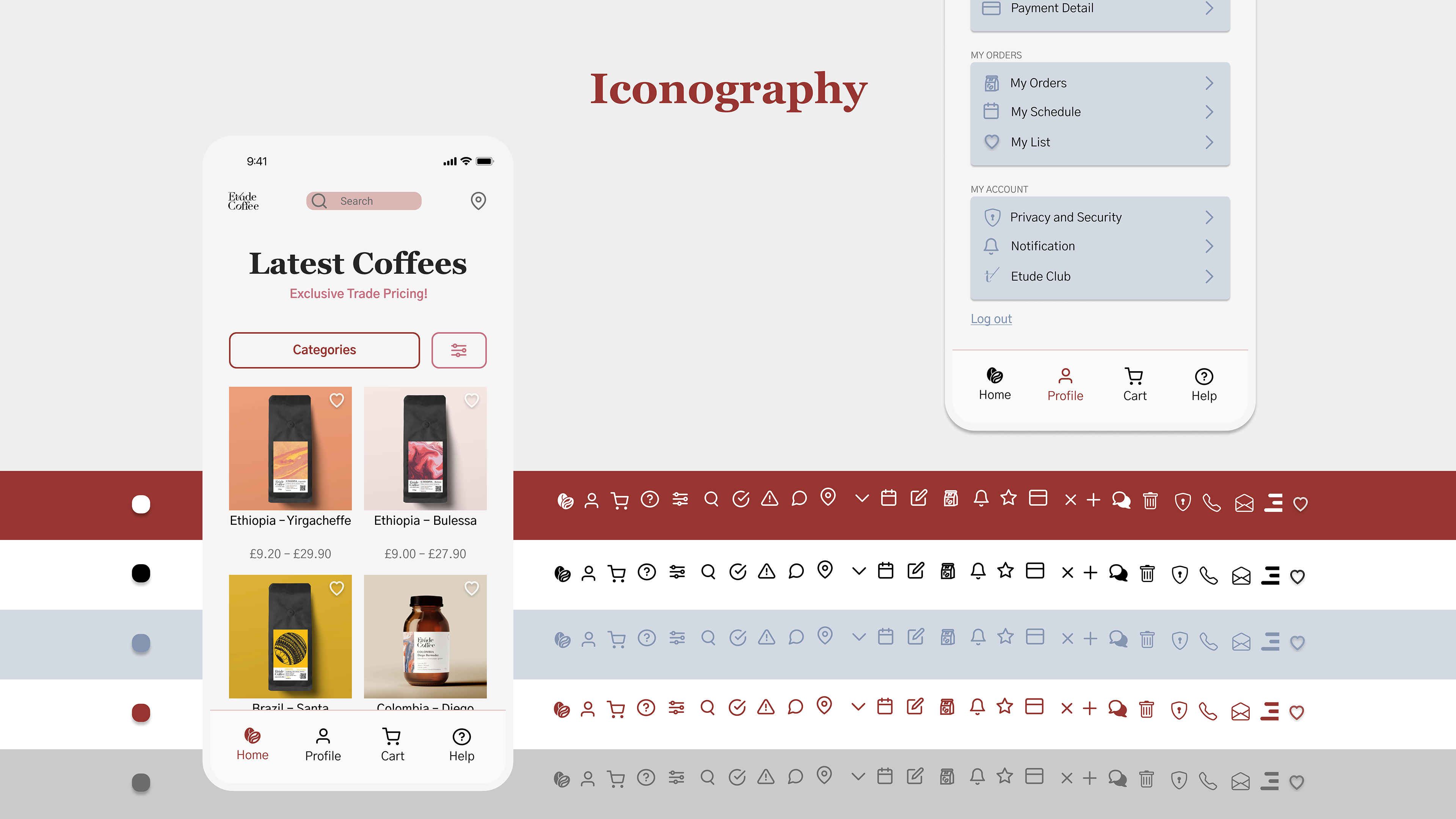
- No clear, consistent brand identity, needing new visual elements.
- Difficult to encourage users to leave Google reviews.
- Hard to navigate and filter information easily across pages.
- Inconsistent and complicated shopping process with too many unnecessary steps to purchase products.
- No clear, consistent brand identity, needing new visual elements.
- Difficult to encourage users to leave Google reviews.
- Hard to navigate and filter information easily across pages.
Goal and Solution
- Provide Informative Pages with Concise Content and Clear Explanations.
- Create a Smooth Shopping Experience with Fewer Steps.
- Implement a User-Friendly and Engaging Pop-Up Screen to Encourage Reviews.
- Ensure Easy Navigation to Find and Filter Information and Pages.
Before/After
User Stories
Story 1
Lucy, a restaurant owner with limited knowledge about coffee beans, consistently purchases Colombian beans. However, when she tries to reorder, she finds they are out of stock. She would like to receive expert recommendations for similar products to make an informed purchase.
Low-Fidelity to Mid-Fidelity Wireframes
Lucy wants to reorder Colombian coffee beans, but they are out of stock. She needs recommendations for similar products.
Story 2
Sheila, a local café owner, wants to ensure she never runs out of coffee supplies. She often forgets to reorder on time, so she would like to have a feature that allows her to set a reminder for a specific date to receive an email or SMS notification to reorder her coffee.


Designing for Different Breakpoints
The 8pt grid system was used to define dimensions, padding, and margins of elements, applying multiples of 8. The phone layout is organised into 4 columns, with row spacing also adhering to the 8pt grid. For tablets, an 8-column grid was applied, while for desktop, a 12-column grid was used.
High-Fidelity Wireframes
Shop with Ease: A Walkthrough of Etude Coffee
Enhancing Engagement with Artistic Animations
To enhance user engagement and visual appeal, I introduced animations inspired by famous paintings, such as Salvador Dalí's "The Persistence of Memory." These artistic elements reflect the brand’s creative identity and evoke familiarity, encouraging interaction and reviews from users.
Next Steps
With the new design in place, Etude Coffee now offers a seamless, engaging, and visually rich experience for trade customers. From simplified navigation and interactive features to a cohesive brand identity, every aspect of the redesign has been carefully crafted to improve the overall user experience.
Moving forward, the focus will be on refining the design further by incorporating user feedback and continuously evolving to meet trade customer needs. The goal is to ensure that Etude Coffee remains a user-friendly, innovative platform that consistently delivers a premium shopping experience.
